Drag & Drop w/ Angular Material/CDK
Leverage Angular Material CDK to implement the drag & drop feature in your Angular app.
Angular version: 8.x
Angular Material: 8.2.3 or later
Node Version: 10.9 or later
Angular Material/CDK 7.1.1 came boasting some really exciting new features such as support for drag & drop functionality. In this post, I explain how it works and I walk you through how to implement it in your own project.
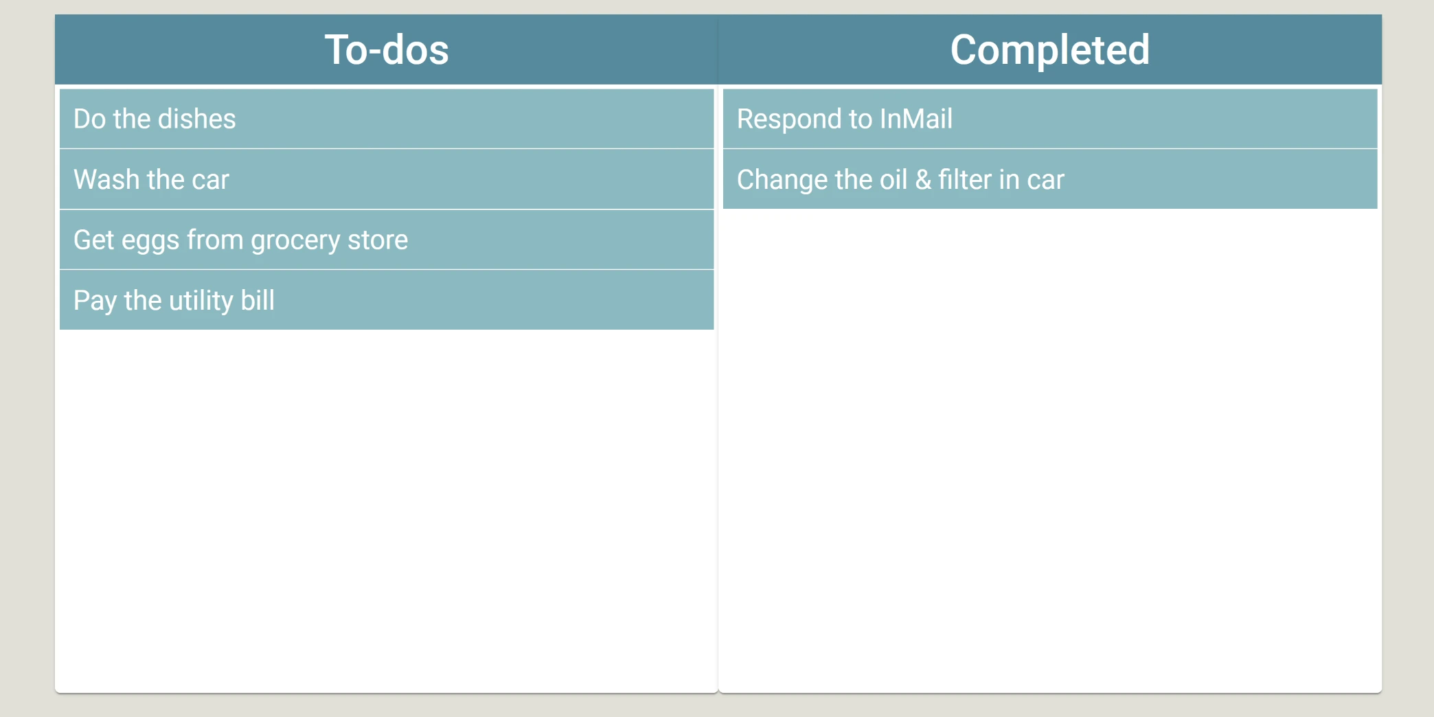
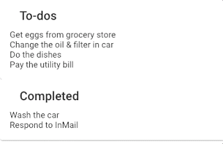
We’re going to build a simple, responsive UI for a to-do application. We’ll have a “Todo” list and a “Completed” list and we’ll be able to drag and drop to-do items back and forth between them as well as reorder them. In the end, we’ll have something that looks like this:
There are two ways to approach my post:
- Clone my project from Github, run it locally, and skip to the “Adding the Drag & Drop Functionality” section.
- Start below and I’ll walk you through how to set up your drag & drop project from scratch
Getting started from scratch
Note: this section assumes that you have already installed Nodejs and the Angular CLI
Open up the terminal, navigate to your desired directory, and run ng new your-project-name --style=scss and follow the prompts. This generates a new Angular project that uses SCSS by default, which we will later use to style the app.
We also need to add Angular Material to our project so navigate into your project directory and run ng add @angular/material. You will get the following prompts:
- Choose a theme — in this demo we don’t really use the built-in Material theme so choose whichever one you like.
- Set up HammerJS for gesture recognition — choose yes. For more about HammerJS in Angular, check out this blog post from Angular In Depth.
- Set up browser animations for Angular Material — choose yes. This will import the
BrowserAnimationsModuleand add it to the imports forapp.module.ts.
The Basic Setup
We need to do some quick setup here to get ready to add the drag and drop functionality. I’m going to place the to-do list and the completed list in Angular Material Cards so in app.module.ts, we need to import the MatCardModule from Angular Material and add it to the imports array in the NgModule decorator. At this point, your app.module.ts should look like this:
import { BrowserModule } from '@angular/platform-browser';
import { NgModule } from '@angular/core';

import { AppComponent } from './app.component';
import { BrowserAnimationsModule } from '@angular/platform-browser/animations';

import { MatCardModule } from '@angular/material/card';

@NgModule({
    declarations: [AppComponent],
    imports: [BrowserModule, BrowserAnimationsModule, MatCardModule],
    providers: [],
    bootstrap: [AppComponent]
})
export class AppModule {}
Next, we’ll replace the boilerplate html in app.component.html with the following:
<div id="pagewrapper">
    <section class="todos-section-wrapper">
        <mat-card class="card">
            <mat-card-header class="card-header">
                <mat-card-title class="card-title">To-dos</mat-card-title>
            </mat-card-header>
            <mat-card-content class="card-content">
                <div class="list">
                    <div class="todo-item" *ngFor="let todo of todos">{{todo}}</div>
                </div>
            </mat-card-content>
        </mat-card>

        <mat-card class="card">
            <mat-card-header class="card-header">
                <mat-card-title class="card-title">Completed</mat-card-title>
            </mat-card-header>
            <mat-card-content class="card-content">
                <div class="list">
                    <div class="todo-item" *ngFor="let todo of completed">{{todo}}</div>
                </div>
            </mat-card-content>
        </mat-card>
    </section>
</div>
You will notice we have some errors when we do this and that’s because we have *ngFor structural directives referencing arrays we have not yet declared in app.component.ts. Let's do that now by adding the following property declarations to our app.component.ts file:
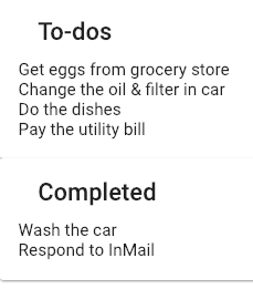
  todos: string[] = [
    'Get eggs from grocery store',
    'Change the oil & filter in car',
    'Do the dishes',
    'Pay the utility bill'
  ];

  completed: string[] = [
    'Wash the car',
    'Respond to InMail'
  ];
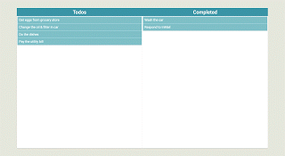
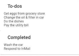
At this point, if you run your app and look at it in the browser, you should have something like this:
Adding the Drag & Drop Funcionality
Now the real fun begins! Let’s make each to-do item draggable by adding the cdkDrag attribute to the divs containing our to-do items. (Don't forget to do this for both the to-do section and the completed section). This will allow us to drag the to-do items wherever we want, but it allows us to drop it anywhere too - including on top of another to-do.
We can fix this by adding the cdkDropList attribute to the divs containing our list of to-do items. Now, if we try to drag and drop them anywhere outside of the div or on top of another to-do like we did above, they will snap back into place.
We still can’t re-order to-do items in the same list or drag to-do items over to the completed list and back, though, so we still have some work to do. Let’s focus on reordering the to-do items within the same list, first. We can do that by listening to the cdkDropListDropped event on the container. We'll need to define our own function in app.component.ts to fire when this event is emitted and determine the new index of the to-do item. Our function should look like this:
drop(event: CdkDragDrop<string[]>) {
    moveItemInArray(
      event.container.data,
      event.previousIndex,
      event.currentIndex
    );
}
The function named moveItemInArray is a built-in function offered by the Angular CDK so we'll need to import that as well as the CdkDragDrop event type from @angular/cdk/drag-drop at the top of our app.component.ts file.
If we test this in the browser, however, we’ll see that it doesn’t work and we’re still getting errors. This is because the container of our to-do items is firing the cdkDropListDropped event, but the container has no knowledge of our todos array. The container needs to be aware of our array so the cdkDropListDropped event contains information about the previous index and the new index of the to-do item we're dragging and dropping. We can achieve that by attaching our todos array to the cdkDropListData property on the container element. Here's what our app.component.html should like now:
<div id="pagewrapper">
    <section class="todos-section-wrapper">
        <mat-card class="card">
            <mat-card-header class="card-header">
                <mat-card-title class="card-title">To-dos</mat-card-title>
            </mat-card-header>
            <mat-card-content class="card-content">
                <div class="list" cdkDropList [cdkDropListData]="todos" (cdkDropListDropped)="drop($event)">
                    <div class="todo-item" *ngFor="let todo of todos" cdkDrag>{{todo}}</div>
                </div>
            </mat-card-content>
        </mat-card>

        <mat-card class="card">
            <mat-card-header class="card-header">
                <mat-card-title class="card-title">Completed</mat-card-title>
            </mat-card-header>
            <mat-card-content class="card-content">
                <div
                    class="list"
                    cdkDropList
                    [cdkDropListData]="completed"
                    (cdkDropListDropped)="drop($event)"
                >
                    <div class="todo-item" *ngFor="let todo of completed" cdkDrag>{{todo}}</div>
                </div>
            </mat-card-content>
        </mat-card>
    </section>
</div>
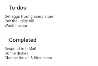
If we save our changes and refresh the browser, we should now be able to reorder items within the same container.
It works! Unfortunately, we still can’t drag the items from one container to another. For example, we can’t drag a to-do item we’ve completed over to the completed container. Let’s take a look at how we can do that now.
Since each section is displaying the list of items in its respective array, to make the item we drop appear in the other section, we’ll need to push it into the array that section is displaying. We already have our drop function, which fires when an item is dropped so we just need to add logic to it to determine if we're dropping the item within the same container or a different one. In order to do that, though, the event we pass into our drop function must contain information about the previous container as well as the new.
Since the event is emitted from our container elements, our container elements need to be aware of one another. We can accomplish this by setting the cdkDropListConnectedTo property equal to the other container element. We can reference the other container element in one of two ways:
- By the id property
- By the template reference variable
Since id properties are often used for other things such as e2e testing and may be changed, I try to avoid referencing them in my code. So I’m going to use a template reference variable. At this point, our app.component.html should look like this:
<div id="pagewrapper">
    <section class="todos-section-wrapper">
        <mat-card class="card">
            <mat-card-header class="card-header">
                <mat-card-title class="card-title">To-dos</mat-card-title>
            </mat-card-header>
            <mat-card-content class="card-content">
                <div
                    cdkDropList
                    #todoList="cdkDropList"
                    [cdkDropListData]="todos"
                    [cdkDropListConnectedTo]="[completedList]"
                    class="list"
                    (cdkDropListDropped)="drop($event)"
                >
                    <div class="todo-item" *ngFor="let todo of todos" cdkDrag>{{todo}}</div>
                </div>
            </mat-card-content>
        </mat-card>

        <mat-card class="card">
            <mat-card-header class="card-header">
                <mat-card-title class="card-title">Completed</mat-card-title>
            </mat-card-header>
            <mat-card-content class="card-content">
                <div
                    cdkDropList
                    #completedList="cdkDropList"
                    [cdkDropListData]="completed"
                    [cdkDropListConnectedTo]="[todoList]"
                    class="list"
                    (cdkDropListDropped)="drop($event)"
                >
                    <div class="todo-item" *ngFor="let todo of completed" cdkDrag>{{todo}}</div>
                </div>
            </mat-card-content>
        </mat-card>
    </section>
</div>
Now that our container elements are aware of one another, we can take a look at adding the logic needed by our drop function to determine where an item should go when it is dropped. We saw before that he Angular CDK had the moveItemInArray function to help us reorder an array of items within the same container. Similarly, we are provided with the transferArrayItem function to help us move an item to a new array so we'll make use of that here. At this point, our app.component.ts file should look like this:
import { Component } from '@angular/core';
import { CdkDragDrop, moveItemInArray, transferArrayItem } from '@angular/cdk/drag-drop';
@Component({
selector: 'app-root',
templateUrl: './app.component.html',
styleUrls: ['./app.component.scss']
})
export class AppComponent {
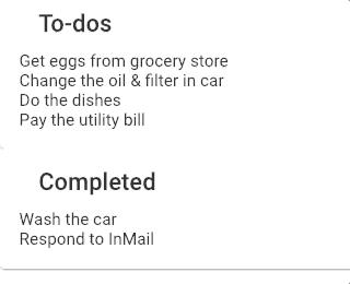
todos: string[] = [
'Get eggs from grocery store',
'Change the oil & filter in car',
'Do the dishes',
'Pay the utility bill'
];
completed: string[] = ['Wash the car', 'Respond to InMail'];
drop(event: CdkDragDrop<string[]>) {
if (event.previousContainer === event.container) {
moveItemInArray(event.container.data, event.previousIndex, event.currentIndex);
} else {
transferArrayItem(
event.previousContainer.data,
event.container.data,
event.previousIndex,
event.currentIndex
);
}
}
}
Notice that we had to import the transferArrayItem function into our app.component.ts. If you save the file and refresh the browser, you'll see that we can now drag and drop to-do items into the the Completed list and back to the To-do list. Our drop function checks to see if the new container is the same as the old one. If it is, it reorders the list based on the index values from the event passed in; however, if the new container is not equal to the old container, the item gets transferred to the array it is linked to by the cdkDropListConnectedTo property on the container.
So now we can reorder our to-do items within the same container and drag them to another container and drop them. Everything works, right? Well… not quite. If you moved all of your to-do items to completed, then tried to move one back into the to-do container, you found that you can’t. The item just snaps back to the Completed container.
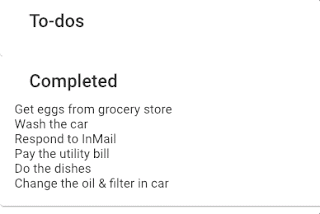
If you’re like me, your first instinct is to look to the browser console and see what the error is. In this case, you won’t find one and that’s because our issue is a frustratingly simple one. When you move all of the to-do items out of their container, the container element collapses making it impossible to drop anything back into it. So let’s go to our app.component.scss file and prevent this from happening by adding the following styles:
#pagewrapper {
    height: 100%;

    .todos-section-wrapper {
        display: flex;
        flex-direction: column;
        height: 100%;
        width: 100%;

        .card {
            display: flex;
            flex-direction: column;
            flex: 1 1 50%;
            padding: 0;

            .card-content {
                height: 100%;

                .list {
                    height: 100%;
                }
            }
        }
    }
}

/********* MEDIA QUERIES ***********/

@media screen and (min-width: 768px) {
    #pagewrapper {
        .todos-section-wrapper {
            flex-direction: row;
            .card {
                flex: 1 1 50%;
            }
        }
    }
}
As you can see, I’m ensuring neither of our list containers collapse by setting our element with an id of pagewrapper and the element with a class of todos-section-wrapper to a height of 100%. I'm also using flexbox to set each card to 50% height for mobile or 50% width for larger viewport widths. If you're not familiar with flexbox, here is an excellent article from CSS-Tricks I find immensely helpful. You'll also find that I've ensured that the height of the element with a class of card-content is set to 100&. Now that we've given our container (which has a class of list) some room, we can set the height of it to 100% to ensure that it won't collapse even when there isn't anything inside of it. If you save that and refresh the page, you'll find that the problem is solved.
It does still look a little drab, though, so let’s add some additional styles to make it a bit more aesthetic. Keeping the rules we wrote to prevent our containers from collapsing, let’s update app.component.scss with this:
$primary: #07889b;
$secondary: #66b9bf;
$dragging: #eeaa7b;
$text: white;
$dt-background: #e0e1d7;

#pagewrapper {
    height: 100%;

    .todos-section-wrapper {
        display: flex;
        flex-direction: column;
        height: 100%;
        width: 100%;

        .card {
            display: flex;
            flex-direction: column;
            flex: 1 1 50%;
            padding: 0;

            .card-header {
                background-color: $primary;
                color: $text;
                display: flex;
                flex-direction: row;
                justify-content: center;
                padding: 0.5em;

                .card-title {
                    font-size: 2em;
                    margin: 0;
                }
            }

            .card-content {
                height: 100%;
                padding: 0.25em;

                .list {
                    display: flex;
                    flex-direction: column;
                    height: 100% !important;

                    .todo-item {
                        background-color: $secondary;
                        border-bottom: 1px solid $text;
                        color: $text;
                        font-size: 1.5em;
                        padding: 0.5em;
                    }
                }
            }
        }
    }
}

.cdk-drag-preview {
    background-color: $dragging;
    color: $text;
    box-sizing: border-box;
    box-shadow: 0 5px 5px -3px rgba(0, 0, 0, 0.2), 0 8px 10px 1px rgba(0, 0, 0, 0.14),
        0 3px 14px 2px rgba(0, 0, 0, 0.12);
    font-size: 1.5em;
    padding: 0.5em;
}

.cdk-drag-placeholder {
    opacity: 0;
}

.cdk-drag-animating {
    transition: transform 250ms cubic-bezier(0, 0, 0.2, 1);
}

.cdk-drop-list-dragging .todo-item:not(.cdk-drag-placeholder) {
    transition: transform 250ms cubic-bezier(0, 0, 0.2, 1);
}

/********* MEDIA QUERIES ***********/

@media screen and (min-width: 768px) {
    #pagewrapper {
        .todos-section-wrapper {
            flex-direction: row;
            .card {
                flex: 1 1 50%;
            }
        }
    }
}

@media screen and (min-width: 1200px) {
    #pagewrapper {
        background-color: $dt-background;
        display: flex;
        flex-direction: row;
        justify-content: center;
        padding: 5em;

        .todos-section-wrapper {
            width: 75%;
            height: 75%;
        }
    }
}
Now, if you save that out and refresh the page in the browser, your app should look like the gifs in the overview section of this article. If you take look at the SCSS snippet above, you will see a few classes we don’t have in our markup. That’s because these are classes provided to us by the Angular CDK to give us full control over the styles of the drag and drop elements (even during their transition to another container). Those classes include:
- cdk-drag-preview
- cdk-drag-placeholder
- cdk-drag-animating
- cdk-drop-list-dragging